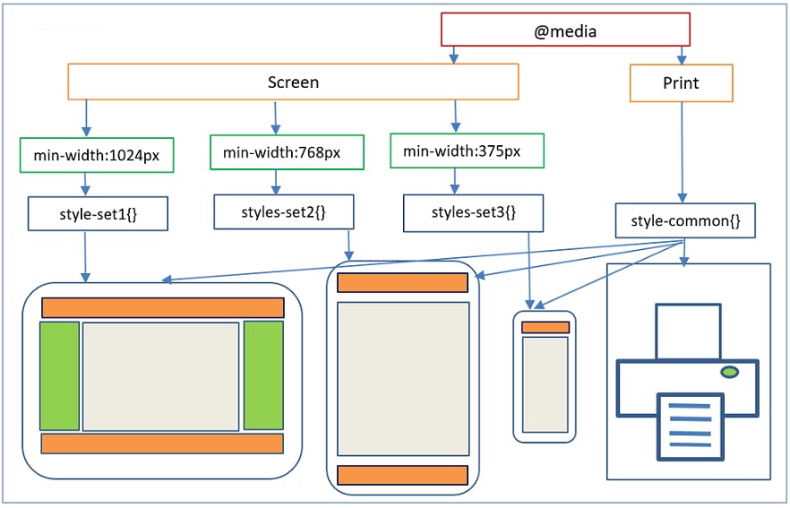
What are Media Queries?
- Media queries can modify the appearance (and even behavior) or a website or app based on a matched set of conditions about the user’s device, browser or system settings.
- CSS Media queries are a way to target browser by certain characteristics, features, and user preferences, then apply styles or run other code based on those things.
- Perhaps the most common media queries in the world are those that target particular viewport ranges and apply custom styles, which birthed the whole idea of responsive design.
/* When the browser is at least 600px and above */
@media screen and (min-width: 600px) {
  .element {
    /* Apply some styles */
  }
}
- There are lots of other things we can target beside viewport width. That might be screen resolution, device orientation, operating system preference, or even more among a whole bevy of things we can query and use to style content.
Do you really need CSS media queries?
- Media queries are a powerful tool in CSS with exciting hidden gems.
- The website should be able to adjust the content based on the screen sizes.
- Using CSS media queries in your website can give more flexibility to your website.
- Website can be accessible from various size devices.
Media Types
all
allcan target specified media queries on all devices- it is the default type
@media all  {
    .container{
        /* styles */
    }
}
screen
screencan target specified media queries on screen devices.- devices like computers, tablets and mobile phones.
@media screen  {
    .container{
        /* styles */
    }
}
printcan target specifies media queries for the printers.
@media print  {
    .container{
        /* styles */
    }
}
Logical Operators
Apart from the above media types some conditionals are used as only , not , and , , for providing additional information based on the conditions.
@media only screen and (min-width: 600px) {
    /* styles */
}
@media screen, print {
  body {
  }
}
Device Breakpoints
- below are the devices used to mention it's minimum screen size.

min-width: 600px; This property is used to give the minimum width from where the given styling should start applying.
@media (min-width: 1024px) {
    .container{
      /* styles */
    }
}
