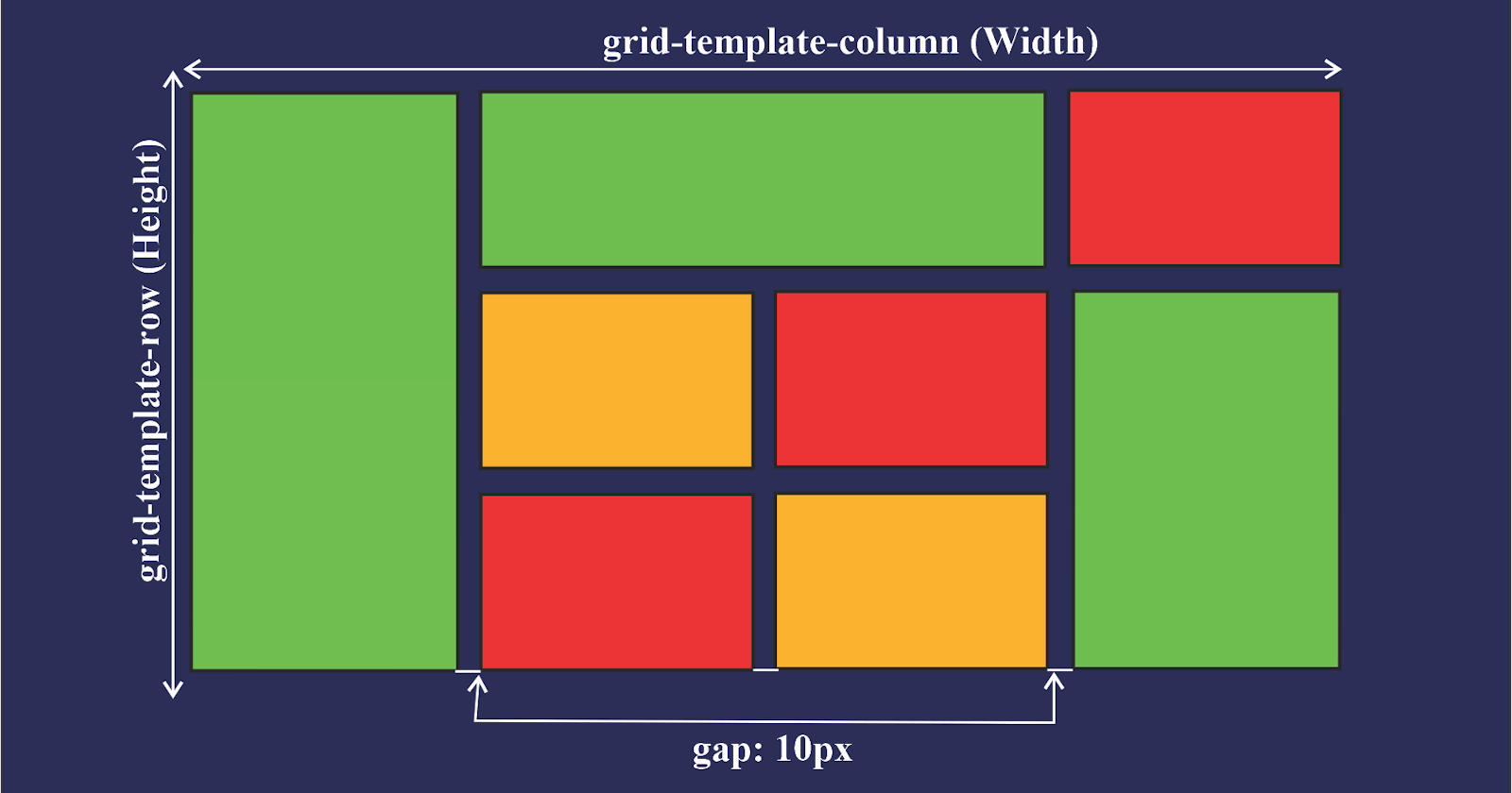
Introduction to CSS Grid
- CSS Grid layout is a two-dimensional grid layout.
- Grid is compared to any web layout system of the past, completely changes the way we design user interfaces
- Using Grid we can make vertical centering easy.
grid-template-columns
- The
grid-template-columnsproperty defines the line names and track sizing functions of the grid columns.
grid-template-rows
- The
grid-template-rowsproperty defines the line names and track sizing functions of the grid rows.
justify-items
justify-itemsis used to justify the grid items along the row axis.- The possible values are
start,end,centerandstretch.
align-items
align-itemsis used to justify the grid items along the column axis.- The possible values are
start,end,centerandstretch.
justify-content
- The
justify-contentproperty defines how the browser distributes space between and around content items along the main-axis of a flex.
grid-column-start
- The
grid-column-startproperty specifies a grid item's start position within the grid column by contributing a line, a span, or nothing (automatic) to its grid placement. This start position defines the block-start edge of the grid area.
grid-column-end
- The
grid-column-endproperty specifies a grid item's end position within the grid column by contributing a line, a span, or nothing (automatic) to its grid placement, thereby specifying the block-end edge of its grid area.
grid-row-start
- The
grid-row-startproperty specifies a grid item's start position within the grid row by contributing a line, a span, or nothing (automatic) to its grid placement, thereby specifying the inline-start edge of its grid area.
grid-row-end
- The
grid-row-endproperty specifies a grid item's end position within the grid row by contributing a line, a span, or nothing (automatic) to its grid placement, thereby specifying the inline-end edge of its grid area.
